
Week one at Metis hit us fast and hard. Although it was only a 4-day work week (thanks to MLK day), we were still expected to crank out our very first project.
The premise of the project was relatively straightforward: analyze the NYC Metropolitan Transportation Authority (MTA) turnstile data.
We were to come up with a fake client and scenario and act as a consulting company to help them solve their problem using the MTA turnstile data. Some project examples include:
Our team of four decided to help out the Manhattan School of Music with getting more exposure for their performing students. There are two main types of performing students at the school: dancers and musicians. Dancers (who perform in the carts and trams) are interested in finding the busiest MTA lines to perform on throughout the day. Musicians (who perform at specific stations) are interested in finding the busiest MTA stations to set-up in.
This is probably the biggest take-away from this project. The raw data will always need a little (or A LOT OF!) fixing up before it’s ready for analysis and despite it being only our first week at Metis, they did not hesitate to throw at us data riddled with problems. The data were logs of the counter at every turnstile at every station for every 4 hours. The counter would increase by one for each person that entered the turnstile, but the counter never started at 0, so to determine the number of entries you had to look at the change in the counter over some block of time. There were 372 stations, 23 lines, and 4,620 turnstiles with counter data every four hours to process.
Some of the main issues with the data were:
Realizing that these issues existed in the dataset is a feat in and of itself and then dealing with them was a whole other beast. But after it’s all said and done, it does feel pretty amazing to achieve work-able, analyze-able data.
To give the basic results, we aggregated the counter data to get daily entry numbers for every station/line to determine popularity (i.e. desirability for performance students). We saw huge trends amongst the weekday stations/lines versus the weekend stations/lines and thus decided to group those results together. The top 5 popular stations and lines are summarized in the table below.
| Rank | Weekday Stations | Weekend Stations | Weekday Lines | Weekend Lines |
|---|---|---|---|---|
| 1. | Grand Central - 42 St. | Herald Sq - 34 st. | 1 | 1 |
| 2. | Herald Sq - 34 St. | Grand Central - 42 st. | 6 | 6 |
| 3. | Rockefeller - 47-50 Sts. | Jackson Heights - Roosevelt Ave. | F | Q |
| 4. | Penn Station- 34 St. | Howard Beach-JFK Airport | 7 | F |
| 5. | Flushing Main St. | Flushing-Main | R | 7 |
In terms of proximity to the Manhattan school of music, the most popular line to ride would be the 1 line and the best stations to hit are mapped out below:

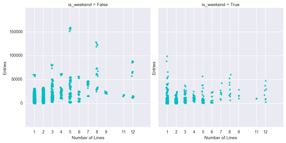
Our group also explored the validity of the intuition: stations with more lines running through them should have more people entering the station. Is this really true? The short answer is no. Although it makes sense that a station with many different lines might attract more people because they can access more places, in reality, the location and centrality of the station is probably more important than the number of lines you can access. See the scatter plot below which plots every station of the MTA in terms of the number of lines that go through it v the number of entries that station receives. We see that there is no obvious correlation between the two, but we do get lots of entries at stations with 5 and 8 lines which probably just coincidentally contain the popular stations like Grand Central, Herald Sq., etc.
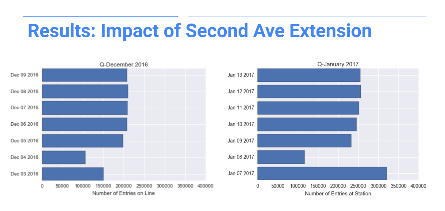
Something else interesting we stumbled upon while analyzing the data was the effect of the 2nd Ave. extension onto the Q line which just opened up on 1/1/2017. We were comparing data from Jan. 7-13, 2017 and Dec. 3-9, 2016 to ensure that our weekend and weekday results were consistent across different weeks. Almost all our station and line popularity results were consistent with the exception of the Q line. In December, it had ranked at the 18th most popular line on weekends, but in January, it jumped up to being the 3rd most popular line.
Just to highlight the jump in ridership, check out these bar plots showing daily entries to the Q line in December 2016 compared to January 2017. We see a weekday daily increase of almost 50,000 entries per day and a whopping doubling of the entries on Saturday (but whether this was an anomaly or not merits further investigation).
This post was rather long-winded, so I’ll keep the conclusions short. This project was a great introduction to what I hope will be a very enlightening 12 weeks at Metis. I came out of week 1 super exhausted, but am, in all honesty, ready to be hit with more. So here’s to learning, matplotlib-ing, pandas-ing, and hoping that the data will have mercy on our souls.